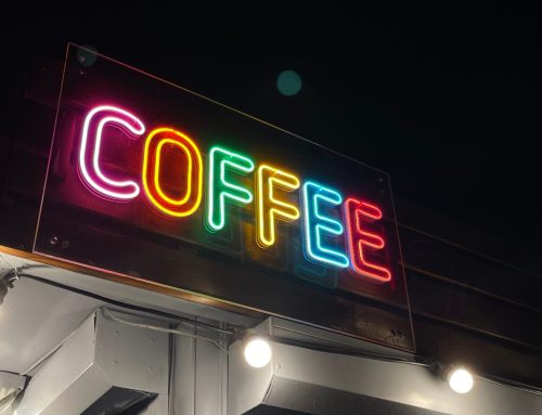
A great restaurant sign is more than just an afterthought. Your sign is one of the first things customers will see when they’re looking for your business, and you want to make sure it’s eye-catching, reflective of your brand, and legible from a distance. In this blog post, we’ll go over 10 factors you should consider when designing a sign for your restaurant.
1. The Right Size and Location 
Your sign should be big enough to be seen from a distance, but not so big that it overwhelms or dominates the storefront. And speaking of location, the sign should be placed at eye level near the entrance of the restaurant for maximum visibility.
2. Eye-Catching Typeface, Graphics, and Colors
The typeface you choose for your sign says a lot about your brand. For example, a more playful font might work well for an ice cream shop, while a sleek and modern font would be more fitting for a fine dining establishment. As for colors, use complementary colors that contrast with each other to make your sign pop.
3. Reflection of Brand Identity
Your sign should be reflective of your restaurant’s overall branding identity. If your brand is friendly and approachable, your sign should reflect that same energy. On the other hand, if your restaurant has a more sophisticated identity, your sign can be more subdued in tone.
4. Regular Updates to Keep it Fresh
You don’t want your customers to see the same stale sign every time they visit your restaurant. A good rule of thumb is to update your signage at least once every few years to ensure it remains fresh and relevant.
5. Visibility from a Distance
When designing your restaurant sign, think about how visible it will be from different distances. If you’re located on a busy street corner, your sign will need to be visible from afar; if you’re tucked away in a strip mall, however, you can get away with a smaller sign since potential customers will likely be closer to the front door when they see it.
6. Legibility from Different Angles
Another important consideration is legibility—meaning how easy it is to read your sign from different angles and distances. The bottom line is that potential customers should be able to read your sign without difficulty, no matter where they’re standing.
7. Clear Message and Call to Action
Your restaurant’s signage should have a clear message that tells customers what kind of food you serve and what they can expect when they come inside. For example, “Fresh seafood served daily” conveys both what you do as well as what makes you unique. Your message should also include a call to action, such as “Come inside for happy hour specials!”
8. High Quality Materials for Durability
Investing in high quality materials pays off in the long run because it results in durability and longevity. You don’t want potential customers driving by only to notice that your sign is faded or damaged — that immediately reflects poorly on your business.
9. Cost-Effective Production and Installation Processes 
Creating an effective restaurant sign doesn’t have to break the bank; there are ways to update or create new signs without spending too much money—especially if you work with an experienced signage company like us!
10. Compliance with Local Regulations and Restrictions
All businesses are subject to local regulations, including restrictions on size, placement, lighting, and more. Make sure you’re familiar with all applicable regulations before moving forward with any changes or additions to your restaurant’s signage.
The Perfect Sign Every Time
If you’re looking for restaurant signs that will help you stand out from the competition, then look no further! L3 Sign & Image can help you create an unforgettable sign that accurately reflects your brand identity and attracts new customers. We offer a variety of high quality materials and production processes to ensure your sign is both durable and cost-effective. Contact us today to get started!


